This article describes the types of input fields. Learn more about the difference between types and what settings are available for each.
The Create form is built based on input fields which simplify the selection process for the user while also ensuring consistency in the inputted data. These fields can also be customized in numerous ways with settings, conditions, and dependencies.
This article describes each input field type, how to configure them and what settings are available.
Overview
Overview of input field types:
Input field type | Description |
Text | It sets a field for entering a free text value. |
Dropdown (single-select) | It sets a dropdown list that allows the selection of a single option from a list of predefined values. |
Multiselect | It sets a dropdown list that allows the selection of multiple options from a list of predefined values. |
Checkbox | It sets a checkbox that allows the user to check or uncheck an option. |
Date | It sets a calendar for the selection of a date or interval of dates. |
URL | It sets a field for entering an URL address. |
Headline | It sets a header with a description. |
Reference* | It sets a dropdown list that allows the selection of a single option from a list of output values (used a key to identify records). |
* Note
From a user perspective, a Reference field doesn't look different from normal dropdown input field. However, it differs significantly in how it is configured and how it works behind the scenes.
Note: You may encounter Datasets when working in the platform. Datasets are sets of value options used in select fields (Dropdown and Multiselect).
Note: General settings and conditions are always available. Select fields have further settings that can be set either from the field or from the dataset itself. Dropdown field (single-select)
Setting a dropdown field shows a dropdown list with predefined values for the user to choose from.
Single selection limits the user to choose one option.
The basic configuration of a dropdown consists in adding a set of values (dataset) to be listed. If you add a shared dataset, a label will appear by the field name to indicate it. If the added dataset has dependencies, you can also decide to include them or not in the field.

Use case: Channel, Source, Platform, Content/Format, Objective, Size, Agency, etc. Settings
- Set as visible
- Set as required
- Set read-only
- Set default value
It opens a dropdown and lets you select a default value from the existing ones.
- Include dependencies
It appears after a Dataset with dependencies is added. It allows you to choose whether to apply or remove them.
Rules: not available. Set from Datasets.
Example
Dataset: Channel
Default value: Social

Multiselect field
Setting a multiselect input field shows a dropdown list with predefined values for the user to choose from.
Multi selection allows the user to choose more than one option.
The basic configuration of a multiselect consists in adding a set of values (dataset) to be listed. If you add a shared dataset, a label will appear by the field name to indicate it. If the added dataset has dependencies, you can also decide to include them or not in the field.

Use case: Country, Brand, Segment Type, etc.
Settings
Delimiter (multiselect field only)
It sets a custom delimiter used to divide the selections.
In the final output, values from multiselect input fields are separated by a delimiter (delimiter-separated values). This setting lets you define what symbol should be used. The default delimiter is an underscore (_).
Other settings:
- Set as visible
- Set as required
- Set as read-only
- Set default value
It opens a dropdown and lets you select a default value from the existing ones.
- Include dependencies
It appears after a Dataset with dependencies is added. It allows you to choose whether to apply or remove them.
Rules
- Limit the number of selections
It lets you define the minimum and maximum number of values that can be selected.
Example
Dataset: Country
Delimiter: -
Default value: Denmark
Number of selections: min. 1, max. 2

Text field
Setting a text field lets a user input a free text value.
To help the user, you can also check the `Suggest previously used values´ feature. This means that the platform will store all values inputted and display them to the user.

Use case: Campaign name, Segment name, Creative concept, PO ID, etc.Settings
- Set as visible
- Set as required
- Set as read-only
- Set default value
It opens a text field and lets you set a default value.
Rules
- Limit character range
- Letter case
- Replace characters
- Set allowed characters
Example
Name: Campaign name
Optional field
Allowed characters: uppercase, lowercase, numbers.
Replace: 22 with 2022

URL field
Setting a URL field lets the user input an URL address.
On the side of the field, an icon changes according to whether the input complies with the requirements you set.
Indeed, when configuring an URL field type, you have the option to set some requirements:
- URL validation.
Checking this box allows you to define the only domains that should be allowed and/or limit the number of redirects.
- Enforce HTTPS.
Checking this box ensures that the input URL always starts with https://

Use case: Landing pages.
URL validation. This allows you to insert domains that are allowed and/or limit the number of redirects.
- Set allowed domains.
It allows you to define the domains that are allowed.
When this validation is enabled, a user is prompted with a warning when they input a domain that is not allowed.
However, the user could still proceed to use a ´not allowed´ domain by clicking ´I know what I am doing´. This is done in case of exceptions.
Use case
To avoid that wrong URLs are used and that a visitor lands on a wrong website, you can set your domain as the only allowed one - www.yourwebsite.com
- Limit the number of redirects.
It allows you to define the maximum number of redirects.
When this validation is enabled, a user is prompted with a warning if the URL has a number of redirects that exceeds the limit set. On the right side, an indication of how many redirects the URL has is also shown. Clicking on it opens a window showing the full path of the redirects.
If this validation is not set, the field will still display the number of redirects and its path, but not the warning.
Best practice
More redirects mean that it takes longer for the final landing page to load. Consequently, this leads to a lower ranking. To avoid this, you should set a limit to the number of redirects allowed.
Enforce HTTPS. This ensures that the inputted URL starts with https://
When this rule is set, http:// URLs is automatically corrected into https://
This also works in real-time, meaning that it would update the URL while the user is typing.
Note: Even if you do not set any of the above features, the URL field still includes some basic validations by default and it will display a warning in case of potential issues. E.g., invalid URL.

However, the warning is not binding. The validations ensure that the user is aware that the URL(s) may be causing issues but does not stop them from proceeding.

This is to make sure that the user is doing something intentionally.
Settings
- Set as visible
- Set as required
- Set default value
The default value must be a valid URL
- Remove query string parameters
Rules: not available.
Example
Name: Landing page
Allowed domain: accutics.com
Number of redirects: 2
Protocol: ensure HTTPS

Checkbox field
Setting a checkbox field lets the user check or uncheck an option.
The default value for a checked box is `true´, whereas the default value for an unchecked value is `false´.
You can change the default setting by checking the ‘Use with custom values’ feature. This allows you to set custom values for the two statuses.

Use case: Booleans / Yes or no questions.
Settings
- Set as visible
- Set default value
It opens a dropdown and lets you select the default status of the checkbox - either checked or unchecked.
Rules: not available.
Example
You want to ask whether this is an external campaign or not.
Name: External
Values: Boolean true/false
Default status: Checked - true

Date field
Setting a date field displays a calendar to let the user select a date.
If you deem it necessary, you can also define an earliest and/or latest selectable date (both optional).

Settings
- Set as visible
- Set as required
- Set default value
It opens a dropdown and lets you select a default date between `Today's date´ and `Tomorrow's date´.
- Set date format
It opens a field to let you define the formatting of the date by using macros.
Rules: not available.
Example
Name: Published on
Earliest selectable date: June 29, 2022
Setting: Optional field

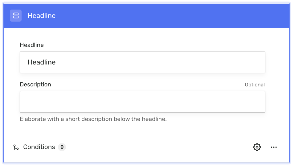
Headline field
Setting a headline field lets you place a heading.
This field is not used to collect data but for formatting purposes. E.g., as a title to separate one section of the record from another.
Its configuration consists of a free text field where you can define the heading to be shown in the form.
An optional description field is also available to let you elaborate more.
Settings
- Set as visible
- Set as required
Rules: not available.
Example
Headline: Tracking Code Form
Description: This is an example...

Reference
Setting a reference field shows a dropdown list with specific output values (created records) for the user to choose from.
The configuration consists in defining the Output field for which to display Output values. Filters can also be applied to limit the options.
The selected Output value is then used to link to a previously created record. This allows you to retrieve data from the referenced record and use them to populate new Outputs when creating them.
Learn more about the reference field here.

Settings
Rules: not available.